I was reminiscing the other day about how we came up with the name Three Bridges Recruitment. It's quite a good story!
I vividly remember sitting amongst packing boxes at Neil Woodley's house in South Queensferry. He had just moved in, and we were balancing a whiteboard on two chairs, brainstorming ideas for our business name. We wanted to avoid using our own names—nothing too self-promotional or corporate-sounding. Instead, we aimed for something that captured the essence of South Queensferry, something iconic yet relatable.
Eventually, Three Bridges Recruitment stood out as the winner. It just felt right, symbolising connection and linking people, which perfectly aligns with our mission. 🌉
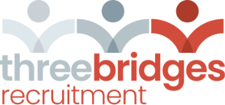
Next up was the logo and colour scheme, which—if I'm honest—not my forte. But we drew inspiration from the iconic South Queensferry bridges, focusing on connections since people are at the heart of what we do. We wanted a design that symbolised "bridging people." 🎨
Our brand colours?
They’re inspired by the area:
- Red for the Forth Rail Bridge, a UNESCO World Heritage Site
- Grey for the sturdy Forth Road Bridge
- White for the sleek, modern Queensferry Crossing
I like to think these colours tell a story of connection and highlight our commitment to building lasting relationships. 🤝
